To sustain user attention and drive audience engagement, journalists and news organizations should learn to use data visualizations.
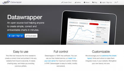
Data visualizations let you explain a set of data simply with an infographic, an interactive application or a chart. With multiple stories competing for users' attention on the boundless Internet, data visualizations are a creative way to interest users in your content and add context or a different perspective to your story. Leading media organizations are using Datawrapper, a simple and free tool, to improve their storytelling. Datawrapper (datawrapper.de) is an interactive chart app that can be embedded into stories such as this one.
As an ICFJ Knight International Journalism Fellow in Nigeria, I work on using digital methods to support journalists in improving their storytelling and driving a wider engagement. Our team of fellows and our local HacksHackers chapter) in Lagos recently organized a data journalism class focused on how to use the Datawrapper application to strengthen storytelling.
Our class participants had never used DataWrapper, but it's so simple to use that they have already returned to their newsrooms and created these visualizations:
• Infographics on population and economic growth
• Social media is a driving force for data demand
Read Onigbinde’s DataWrapper tutorial on IJNet.
*** The International Journalists' Network, IJNet, keeps professional and citizen journalists up to date on the latest media innovations, online journalism resources, training opportunities and expert advice. ICFJ produces IJNet in seven languages: Arabic, Chinese, English, Persian, Portuguese, Russian and Spanish. IJNet is supported by donors including the John S. and James L. Knight Foundation. Photo courtesy of Oluseun Onigbinde.