The International Center for Journalists (ICFJ) is connecting journalists with health experts and newsroom leaders through a webinar series on COVID-19. The series is part of our ICFJ Global Health Crisis Reporting Forum — a project with our International Journalists’ Network (IJNet).
Communicating data can feel like an overwhelming task. As journalists, how can we translate extensive numbers-based research and analysis into coherent, comprehensible reporting?
Data journalists have honed this skill set. They’ve refined how to best present data-related findings to most effectively inform their readers.
In an ICFJ Global Health Crisis Reporting Forum webinar, Jacopo Ottaviani, the chief data journalist at Code for Africa, explained the techniques he uses to conduct research, visualize data and present it to the public. He discussed collecting data, the importance of the y-axis, building trust in your audience and more.
Here are a few key takeaways from the session:
On the methodology of data visualization
Data visualization is the process of conducting research to collect data, filtering and verifying the data collected, visualizing the data into a type of chart and incorporating the data to create a story.
Before creating a story, the most important information must be reflected from the data. “The more we refine the data we find online, the more we increase the value to the public,” said Ottaviani. Data journalists should strive to display the interconnectedness of data and knowledge.
On collecting data
Data can be found in online databases run by governments or NGOs. If the information you seek is not public, you can track data down through university research programs or by crowdsourcing.
Make sure to fact-check and verify your data before visualizing it. When creating your visualizations, remove any information that might clutter your work, like unnecessary titles and descriptions. Then, turn your visualization into a story. Possible content includes multimedia packages, a story series or even social media posts around the data.
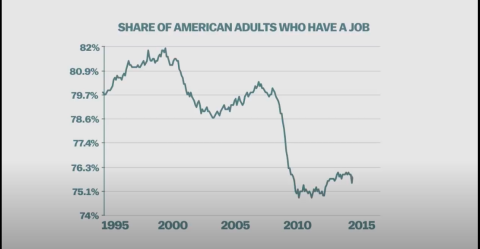
On manipulating the y-axis
Charts and graphs should depict the message from the dataset. Data journalists should know how the y-axis will change the story being told, and ensuring the narrative of the chart is accurate builds trust with your audience. Be careful of mistakes when using data visualization tools.
Contrary to popular belief, the y-axis does not always have to begin at zero to accurately show the data. In a Vox YouTube video discussing the y-axis, they explained, “Narrowing the range to dramatize what we’re talking about isn’t lying with statistics, it’s emphasizing what’s relevant.”
Charts can be manipulated to hide information or focus on certain data points to drive storylines that might compromise what the data truly reflects. The stories you present should align with the truths you want to convey.
On embracing teamwork
Data journalism is a multidisciplinary field made up of journalists, developers and designers who all work together to present their findings. Journalists collect and refine data that meets the needs of their audience. Developers use their tech skills and computer science know-how to help journalists analyze the data. Designers visualize the data using tools that ensure cleanliness, accuracy and visual quality. Each role is essential to the data visualization process.
[View past webinars and key quotes]
Should you share the full data set or only the refined data?
“[Overall,] I would say both,” said Ottaviani. “You need to mention the original source of the data. Then, if you have processed the data in a significant way, you can also include your refined data set in your story somewhere. This can be a footnote at the end of the article where you talk about the methodology of your investigation.
“It is very important that you document your processes so that people can challenge you if necessary,” he added.
When you’re working with projections, which components should you communicate to the reader?
“If you're taking a projection from a research paper or from a website of an institution, you need to make sure you dig into the methodology and the samples that they're using, and the assumptions that they are [making] to draw those projections,” said Ottaviani.
“Loop your reader in and tell your reader that that's a projection. Try to explain the assumptions and also explain the limits of those projections, because projections can be wrong in some cases. So it's important that you highlight that,” he added.
Here are some tools and resources for data journalists mentioned during the webinar:
- Data Wrapper (toolkit)
- Flourish (toolkit)
- Lists of reliable sources by Quartz (datasets)
- AwesomeData (datasets)
- How to Lie with Maps (guide)
- Data Journalism Handbook (guide)
- More resources from Jacopo Ottaviani.